Author Archives: Chloé Wolifson

About Chloé Wolifson

Chloé Wolifson is an independent arts writer and curator based in Sydney, Australia.

Where am I going? Moments of illumination and doubt in the work of John Olsen

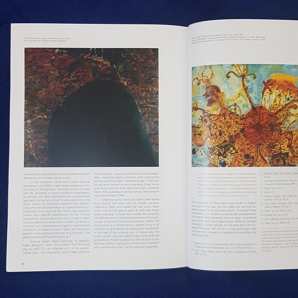
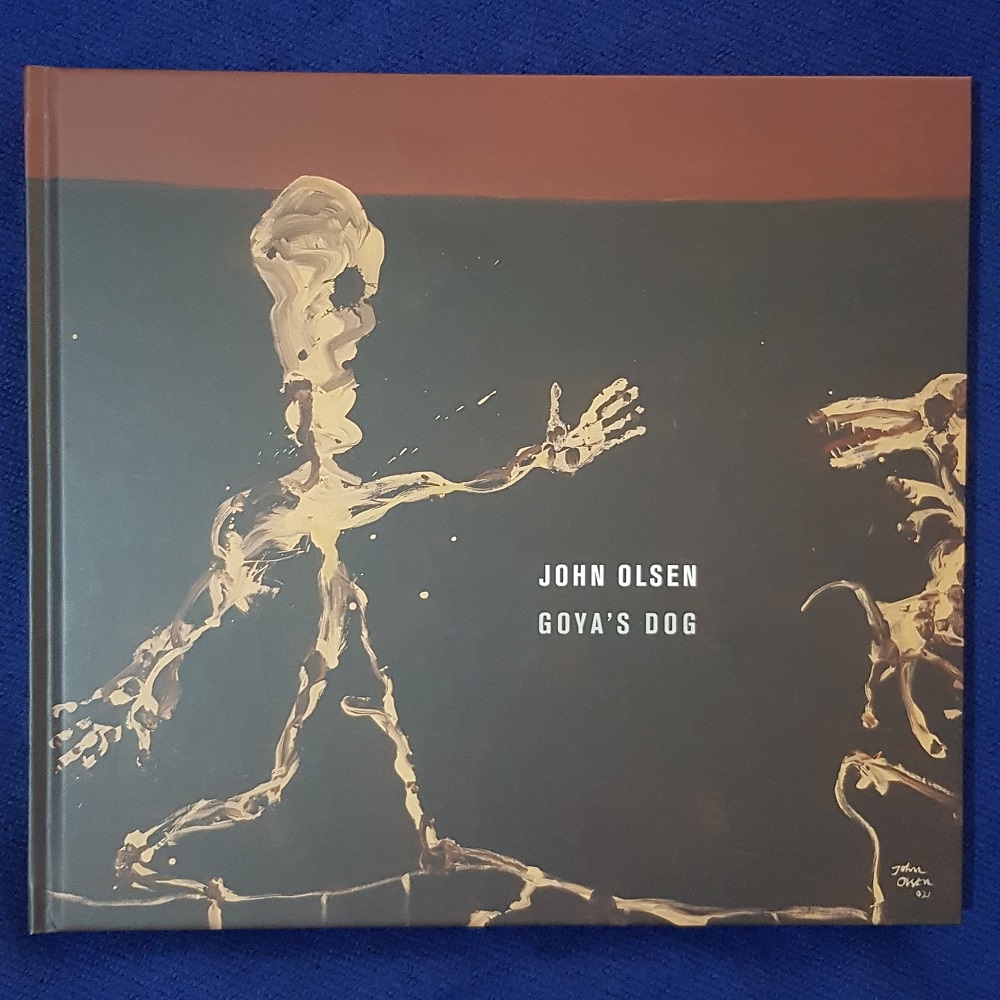
John Olsen: Goya’s Dog (at the National Art School, Sydney from 11 June to 7 August 2021) spans eight decades of the artist’s practice, from the 1950s, when he first visited Spain, to the present. This exhibition tracks the influences of these Spanish encounters on the artist’s sensibility, his palette, and how he views the landscape and the human condition. It delves into the introspection and darker elements that pervade his work, and contrasts these with the sunny, more exuberant aspects of his practice. Goya’s Dog features over 50 major works, sketchbooks and drawings, many not seen in public for generations.

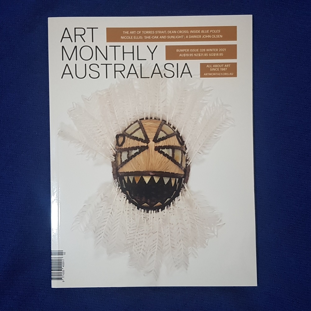
I was honoured to be invited to write the catalogue essay for the publication that accompanies John Olsen: Goya’s Dog. Excerpts from this essay appear on the wall labels throughout the exhibition, and an abridged version also appears in Art Monthly Australasia issue 328 (Winter 2021). Read the introduction below:

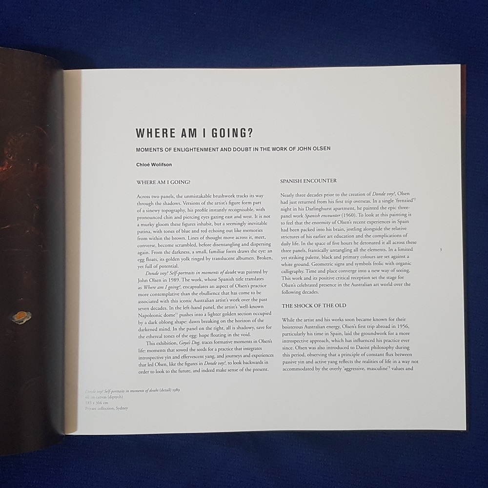
“Across two panels, the unmistakeable brushwork tracks its way through the shadows. Versions of the artist’s figure form part of a sinewy topography, his profile instantly recognisable, with pronounced chin and piercing eyes gazing east and west. It is not a murky gloom these figures inhabit, but a seemingly inevitable patina, with tones of blue and red echoing out like memories from within the brown. Lines of thought move across it, meet, converse, become scrambled, before disentangling and dispersing again. From the darkness, a small, familiar form draws the eye: an egg floats, its golden yolk ringed by translucent albumen. Broken, yet full of potential.

Donde voy? Self-portraits in moments of doubt was painted by John Olsen in 1989. The work, whose Spanish title translates as Where am I going?, encapsulates an aspect of Olsen’s practice more contemplative than the ebullience that has come to be associated with this iconic Australian artist’s work over the past seven decades. In the left-hand panel, the artist’s ‘well-known Napoleonic dome’[i] pushes into a lighter golden section occupied by a dark oblong shape: dawn breaking on the horizon of the darkened mind. In the panel on the right, all is shadowy, save for the ethereal tones of the egg: hope floating in the void.

The National Art School Gallery exhibition ‘Goya’s Dog’ traces formative moments in Olsen’s life: moments that sowed the seeds for a practice that integrates introspective yin and effervescent yang, and journeys and experiences that led Olsen, like the figures in Donde voy?, to look backwards in order to look to the future, and indeed make sense of the present.”


[i] P. Brown, ‘The Archibald Prize, 1971: An anachronism?’, in Antiques and Art Australasia, vol. 2, no. 7, March 1972, p. 1.

Ali Noble – Telepathic Lovesong

Galerie pompom, Sydney
26 May – 17 June 2021

Installation image by Docqment

Velveteen, Ali Noble’s medium of choice, presents itself in an unfixed manner. Shade, depth and tone shapeshift and shimmer depending on the light conditions and the viewing angle. As the audience, we are compelled to take our time exploring these works and their unsteady state. Not just an ocular interaction, our physical presence in this shared space takes on greater significance. The lure of tactility transfers into a performative state, as bodies carry eyes around the room, and hands long to touch.

The framed works in Telepathic Lovesong might first speak to the viewer as paintings through their scale and form. However, textiles resonate differently, more subconsciously than paint. Fabric lives with us, moves with us, it shields, reveals, contains and recalls. Its tactility can be alluring, comforting, sensuous, therapeutic, repellent. As Noble has noted, from the first time we are swaddled as a baby, textiles are intrinsic to our lives in the world. Cutting and sewing fabric are tactile and performative processes steeped in agency and control.

Noble’s velveteen scenes have a considered simplicity yet are far from flat. Inset rectangles, and the artist’s recurrent use of a symbolic vocabulary of curved, scalloped and teardrop shapes in a variety of sizes, draw the eye into and between these compositions, allowing the brain to invent animal, vegetable and mineral forms inhabiting the abstract. Pastels, too, conjure a myriad of associations, their kitsch further enriched by the crushed velveteen texture. Fairy floss pink and soft, mint green convey an optimistic, decorative impression, while dramatic black forms draw the viewer into the picture plane.

Velveteen is named after its rich ancestor velvet, but the two are quite different. Velvet, with its serious, regal overtones, sucks the light out of the atmosphere, into folds of opacity. Velveteen on the other hand flickers and glints as the viewer’s point of view changes, light dancing in and out of the crushed pile. The largest work in Telepathic Lovesong, Waiting Room, is an expansive expression of these scintillating, camp qualities, in the form of a dramatic silver curtain drawn across the gallery.

Curtains and drapery have been a familiar presence in art history for millennia, as a protective layer for paintings, and as a way for an artist to display a technical flourish. Functionally and dramatically, the curtain is where textiles paradoxically control and are controlled. Beyond the visual arts, the curtain’s role ranges from the dramatic to the quotidian. Whether drawn across the proscenium arch of a theatre or dividing a hospital ward, it cuts us off from what is behind, temporarily suspending belief.

Love, wonder, care, grief and longing are eternal elements of the human condition, even as that human condition is subject to technological advances, and existential threats. Creative and communicative impulses are a manifestation of our journey through this condition. What can be made of Noble’s slowed-down, hands-on, contemplative approach to her work in a screen-focussed, socially-distanced, sped-up world? While the warp and weft of the loom was an early ancestor of modern computing, the fundamental qualities of textiles remain antithetical to that of the screen.

As we have all spent time in the pandemic waiting room, a weird tension has emerged between deflation and inflation, with artworks seeming to get flatter, while their market value soars higher. In that virtual world, it doesn’t matter that we are temporarily unable to stand inside a gallery. The curtain, and the mystery it affords, is a relic. The emperor has no clothes, all that remains visible are his bits, and bytes. For some, the pandemic pivot simply shifts a jet-set pace to the online space. In the world of Telepathic Lovesong, it means something different. Time spent caring, time spent looking through drawn curtains. Not scrolling, but pausing to notice the mysterious ways materials and people communicate. Sometimes, pivoting means arriving, 360 degrees later, back where you started. In a room shared with objects and people, doing a shuffle-dance between shimmering artworks, attempting to decode their signs and symbols, free to move both feet any way you like.

Chloe Wolifson, May 2021

Third Iteration of “The National” Proves to be a Sustainable Spotlight for Contemporary Australian Art

The National: New Australian Art”, a biennial survey exhibition held across three institutional venues in Sydney, Australia, was originally conceived as a six-year, three-edition initiative. Coming to its third iteration this month, it continues to give insightful response to social and universal concerns while celebrating the country’s uniquely diverse art scene.

My review of The National has been published on CoBo Social – read it here.


Diadikasia

Galerie pompom, Sydney
21 April – 23 May 2021

Curated by Nancy Constandelia
Artists: Danica Firulovic, Nancy Constandelia, Belle Blau, Louise Gresswell, Graziela Guardino, Suzie Idiens, Rebecca Waterstone

L: Nancy Constandelia, Untitled (green), 2021, acrylic on Italian linen, 122 x 61 cm Centre: Belle Blau, Gloss Crevasse, 2021, acrylic and varnish on canvas over board, 76.3 x 61 cm R: Danica Firulovic, Warm White Square on White, 2020, oil on Italian linen, 122 x 122 cm

A quick look at Google Translate will tell you that in Greek, Diadikasia means ‘process’. In this era of information overload, it’s increasingly easy to look, ‘understand’, and swiftly move on. But do we really process what is before us? And what happens if there are no shortcuts to understanding?

Art is a space for conversations built on questions, not answers. The paintings in Diadikasia serve as a reminder of this, pushing the viewer into sometimes uncomfortably unfamiliar territory as we search for something to anchor ourselves to in the picture plane. In this space, colours, textures, gradations, and finishes take on new power and resonance, obliging the viewer to slow down and consider how and where meaning is found.

The emotional response to certain colours, or lack of colour, are heightened. We might be confronted by our own reflection, be drawn into the surface through temporal layers, or lose ourselves completely in velvety pigment. We may recall a particular landscape or be transported to a state of mind beyond the worldly. Material and memory are fused; the painting is an interface. The artist’s meditation becomes the viewer’s, the work a mirror or a mandala. The surface is pleated, poked, caressed, divided, built up and scraped away. The more time is applied to the work, the more penetrable it becomes. The process is the panacea for two-dimensionality. In taking the time to stand before these paintings and experience them, we allow our senses to guide us to a state of connection – with the materials, with our own emotions and perhaps even those of the artist. These works might leave the viewer at sea or plonk them firmly somewhere unexpected.

While occupied by shared concerns, Diadikasia also highlights the significant differences between these artists’ practices. Their influences, approaches to materials and processes are far from singular, simplistic, or straightforward. Here, seen side by side, we are encouraged to seek out the subtleties and variations in approach.

Several of the artists in the exhibition take two-dimensionality as a challenge, conjuring seemingly impossible depth from the flatness, while others treat the painting as a sculptural relief, playing with the tactility of the surface. In some works, the process is premeditated and meditative, while in others the materials lead the artist’s hand in unplanned, unexpected directions. Perfection might be built up patiently through layers, or failed paintings and studio detritus might be repurposed and given new life.

Psychological exploration, the poetics of relationships, the impact of place, the mindfulness of practice, allowing the process and materials to speak. While each artist’s motivations are different, all come from a space of deep consideration of the conditions within the artist’s mind and within her studio. Diadikasia breaks apart stereotypes, revealing the great variety of insights that contemporary artists working in this shared mode can generate.

Many viewers will come to these works with a Western, male, conceptualist legacy in mind. Regardless of the art-historical frames of reference we might call upon when viewing non-objective, monochromatic abstract paintings, in the end these paintings will give the most when we honour the time that was taken to create them, by giving our own time in turn. In a world of the quick glance, the scrolling feed, and the instant answer, it could be more important than ever to allow ourselves to be drawn into the unknown – and to take our time there.

Chloé Wolifson, April 2021

Caz Haswell – Mother Tongue

Caz Haswell, Chateau cardboard 2020, calico, cotton thread, 122x40cm. Courtesy the artist and Galerie Pompom, Sydney

Caz Haswell’s mother was an avid list maker. Interspersing typewritten and handwritten text, the work Mothers Attributes is a list compiled by the two women together around 1998. It displays the artist’s late mother’s knack for language and for picking up the local vernacular during her five years running the General Store in Hill End, New South Wales:

Weather forecaster / day keeper / procurer of gunmen to shoot half dead dogs /
fuel quality expert / telephone directory / turkey broker / reporter of escaped horses / rescuer of the injured / post mistress / knitting needle exchange / bank, no interest charged / social director / counsellor / behaviour supervisor / drinker of white wine / pause button pusher / talker / …and poet

This brief but vivid collection immediately conjures the general store as a hub of town life, confirming the undoubted fortitude and good humour that would have been necessary in order to wear so many proverbial hats.

Over the years, Haswell herself has been collecting lists of slang terms and idioms as potential titles for artworks. After coming to the realisation that in generating pages and pages of these colloquialisms she had in fact created a work in itself, Haswell gathered them into a new form for the piece Showing not telling (2020). A banner of flannelette sheet hangs by two tabs, its particular pattern of vertical pastel stripes immediately recognisable to anyone who was regularly tucked into bed in a certain era. Running perpendicular to the stripes are a series of cross-stitched phrases:

COOLING THE HEELS / BUTTER ZONE / TRIPLE THREAT / CLAPS AND SNARES / ICE TO MEET YOU / FUR COAT AND NO KNICKERS / STATE OF NATURE / TENDER LOIN / FORCE OF DETONATION / SUNSET CLAUSE / HONEY TRAP / SHARE OF MOUTH / NO FRILLS NO FAT / RIPPLE AND BLUR / SHOWING NOT TELLING

It is a curious combination: the soft, pastel-hued cotton of the flannelette, with its cosy connotations, disarms us before the block letters hit us with their suggestive implications in stitched black pixels. The artist’s great grandfather made tapestries (an art therapy practice of sorts) and after discovering his large works at home, a young Haswell was introduced to the practice by her aunt. Haswell enjoys the slow, laborious process of needlepoint, its automated, repetitive rhythms allowing space for contemplation.

In the work Chateau cardboard (2020), the phrases sausage roll/tomato sauce/chateau cask are stitched onto an apron. The text was originally jotted down by Haswell’s mother as an end-of-day musing about what to have for dinner after a long day cooking for others in the Hill End General Store café, and one can see parallels between the process of stitching the words and the act of jotting them down in the first place. And of course, an apron is an amusing site to memorialise this gourmet combination.

Haswell also hand builds sculptures from clay, a process which, in contrast to the meditative process of needlepoint, requires continued concentration and a forensic attention to detail. Despite this opposing approach, these clay works nonetheless also seduce with the familiarity of their forms, before inverting these expectations. The sculpture Full lambchop is in fact a to-scale rendering of a lamb chop in white clay, the sexual associations of its title and form providing a connecting thread with the text of Showing not telling.

Meat has made its way into the show via a photograph, taken by Haswell at the age of seven, of her mother after arriving home from the pub having won the meat tray that evening. The photograph, Mother and child, is included in Mother tongue, as is a white clay sculpture of the meat tray itself (from which the subject of Full lambchop originated). The use of clay to sculpt meat evokes rich and varied associations, the cold silky malleability of the clay in wet form echoing the cool give of the meat, before transforming into something quite different: a dry, hard finished product denuded of both colour and context.

Throughout Mother tongue, language and materiality are used to explore evocations of the body, particularly through references to food and sex. Like meat, smoking is also loaded with connotations. Holy Smokes (2020), a framed work on paper listing euphemisms related to this now outmoded vice, rests on casts taken of Haswell’s mother’s ashtray. Once a ubiquitous household object, in Holy smokes the ashtray’s functionality has been converted into a literal prop for the text: selling smoke / smoke without fire / big smoke / passive manslaughter / second hand smoke / smoke house. This set of phrases has its own internal rhythm, with a jarring note midway – another composition formed of unexpected evocations.

Fuck you / very much, declares a 2019 work of the same name. The words are cross-stitched into terry towelling, playfully contaminating the idea of the monogrammed towel signifying domestic bliss. Haswell recently relocated to live in the same country region as Hill End, a place which played a formative role in her life as a young woman during the years her mother lived there. While the works in Mother tongue are, in part, a way for Haswell to gather and interweave the threads of her and her mother’s personalities and lives, the show is also an undertaking to establish boundaries in relation to her past, and to the ongoing formation of her own identity.

Chloé Wolifson, July 2020

Caz Haswell’s exhibition Mother Tongue took place at Galerie Pompom, Sydney from 19 August – 13 September 2020. My above catalogue essay was published to accompany the exhibition.

Floria Tosca – Bearing Witness

Floria Tosca, Pan, Pencil, gouche and ink on paper, 105cmX150cm. Courtesy the artist and Flinders Street Gallery, Sydney

The term ‘animal kingdom’ implies the largest, grandest and most intelligent animals standing regally at the top of the pile, but Floria Tosca invites us to reimagine the order of things. While humans tend to identify with the behaviour our closest primate relatives, Tosca wonders whether we might find more parallels with the ‘hive mind’ of insects and other creatures. Our desire to connect even when not in physical proximity saw us invent networks and modes of communication that mimic those of insects, birds and flying mammals. Now, warned against physical connection for the time being, we continue to be linked by invisible impulses.

That patriarchal phrase ‘animal kingdom’ also implies the crown worn by the monarch. Across the world’s cultures, head adornments are employed to signify power. We might not know the laws of a locality but we can identify who’s in charge by what’s on their head. While humans consider ourselves the righteous rulers of planet Earth, Tosca observes that we are currently being well and truly lorded over by a microscopic agent that also favours the form of a crown: coronavirus.

This menacing form has found its way into Tosca’s new works, insinuated into the corners of compositions amongst the flora, and sprouting mushroom-like from the eyes of skulls. It’s not only microbes that get scaled up: Tosca zooms in on birds, bats and insects, a reminder of where these creatures really belong in the schema of things. Bats in particular, but also ladybirds, are here to remind us of how we have tipped the scales of ecological balance: bats being a host for coronavirus, while ladybirds are symbolic of the collateral damage suffered by creatures through bushfires.

Tosca employs in her practice a visual taxonomy comprised not only of images of birds, insects and other creatures, but also of studies made of the outline form of plants. These elements become the basis for visual arrangements characterised by intuitively balanced form and colour, courting abstraction yet unmistakeable in their organic origins. In works such as Pan the composition respects the boundaries of the paper support, embracing symmetry, while in Remember, the goat hide Tosca has used to work on cuts its own silhouette, its form containing the echoes of a life. Living and dead, joyous yet dark, the subjects in Bearing Witness ponder the singular condition that is both degeneration and regeneration.

Chloé Wolifson, August 2020

Floria Tosca’s exhibition Bearing Witness took place at Flinders Street Gallery, Sydney from 15 August – 5 September 2020. The exhibition text above was published to accompany the exhibition.

Paul Snell – Bleed

Paul Snell’s works seduce and envelop us. In Bleed, Snell takes a soft-edged approach to the colour field rather than the hard-edge aesthetic of his works from the past decade. Playing with appropriated visual imagery to create abstractions that explore the potential of photo-media, some works explore a single or related group of hues, such as a soft fairy floss pink or a harmony of turquoises. In other works, contrasting colours swirl and bleed together, forming tantalising compositions that compel the viewer to search the surface for narrative answers which remain elusive.

While Snell has previously employed glossy surfaces, inviting viewers to reflect on the ubiquity of screen culture, the matte finish used in the Bleed series absorbs rather than reflects light. The photographic image is face-mounted to Matte Plexiglas, embedding colour in the object itself. The viewer is drawn into the image, yet the diffused tonality of the photograph prevents our eye from getting a secure hold on the composition.  The resulting experience is a slow push-pull between image and viewer.

Long interested in non-objective works that embrace object-hood, Snell has recently been applying this to his own practice in an increasingly overt fashion, developing sculptural substrata for his Chromogenic prints. These gnarled, distressed elements, the result of experimentation with chemical reactions on polystyrene and painted and poured concrete, lurk behind the Plexiglas surface. While the photographic images employ bright and pure tonalities, the substrata bear the colours of rusted and oxidised metals. These gritty, crusty components challenge the seductively liquid surfaces of the works – each heightens the experience of the other and evokes further associations, from the microscopic to the macrocosmic.

Snell shares the aesthetic and conceptual concerns of 20th century modernist painters, while taking the 21st century digital image as a material starting point. Bleed explores and exploits the emotive and evocative effects of colour, both in an ocular sense and a physical one – as we stand in front of these works, our eyes seeking an entry point to the abstract and minimalist compositions, the matte surfaces absorb light and seem to absorb us as well.

In the course of developing this body of work, Snell came across the term longing for less, a reaction to the relentless inundation of imagery in the current era. “’Longing for less’ resonated in terms of breaking down this imagery and creating voids, spaces, moments in time, shifts and places for people to sit, contemplate and just lose themselves in the colours.” In introducing the sculptural bases for the works in Bleed, Snell brings this potential of the pixel into sharp (or in this case, soft) relief.

Chloé Wolifson, July 2020

Paul Snell’s exhibition Bleed took place at Gallery 9, Sydney from 15 July – 08 August 2020. The exhibition text above accompanied the exhibition and can also be heard in the above video tour.

2020 Adelaide//International at Samstag Museum of Art

In late February, I travelled to Adelaide for the launch of the 2020 Adelaide//International at the Samstag Museum of Art. The launch was timed to coincide with other Adelaide Festival events including the Adelaide Biennial of Australian Art, and I enjoyed a jam-packed weekend of exhibitions and events, with highlights including a keynote address from stalwart Australian artist Stelarc, a performance by New York-based Australian artist Julian Day and collaborators in a heritage Masonic Lodge setting, and exploring Biennial artists’ works in the gorgeous Adelaide Botanic Gardens.

Of course, this was just before travel restrictions and social distancing came into play, and it was through the lens of a pandemic world that I sat down to write my review of the 2020 Adelaide//International, probably my last press trip for a while. With a focus on architecture as choreographer of human experience, it was hard to ignore our ‘new normal’ when pondering the works in the show. My review can be read here.

Brad Darkson, Research for Hold Me, 2020. Photo: Brad Darkson

It was a pleasure to again write for Artlink. My other reviews for this publication can be found here and here.


22nd Biennale of Sydney: NIRIN

My profile on South African photographer and visual activist Zanele Muholi was published at a precarious time for the art world. Filed in the midst of a very busy day during the media tour of the 22nd Biennale of Sydney in early March, little did we know that soon after, all venues would close to the public amid coronavirus prevention precautions. I feel exceptionally fortunate to have experienced the media preview of NIRIN, travelling to venues across Sydney to take in the many works and experiences of this groundbreaking Biennale. I look forward to again congregating with colleagues and artists, sharing a space of contemplation and stimulation around art.

Muholi’s arresting self-portraits and portraits of the South African LGBTQI+ community were featured at the Museum of Contemporary Art Australia. My interview with the visual activist was cover story of The Sydney Morning Herald Spectrum on 14 March, and can be read online here.

Stanislava Pinchuk: The Red Carpet

“Seventeen years ago – on March 18, 2003 – David Burgess and Will Saunders climbed the sails of the Sydney Opera House and painted in looming red letters the words NO WAR. The pair were sentenced to nine months’ weekend jail and divided the nation between those appalled at the iconoclasm and those who believed the message made the gesture worthy.

A decade after Burgess and Saunders’ defiant act, on the other side of the world, pro-democracy protests began in Maidan Nezalezhnosti, or Independence Square, in the Ukrainian capital of Kiev. The collective weight of the protesters, accumulated over months, caused the Maidan’s granite slabs to crack. The protests turned tragically fatal and marked the beginning of the Ukrainian revolution and the ongoing civil war.

For Ukrainian-born, Melbourne artist Stanislava Pinchuk, 31, these two public spaces, arguably the hearts of their respective nations, span her two citizenships. Pinchuk has brought both sites together in a new photographic work The Red Carpet, which she will unveil in conjunction with a lecture titled The Thread of War at the All About Women festival at the Sydney Opera House on March 8…”

Read my profile of artist Stanislava Pinchuk, published in The Sydney Morning Herald Spectrum, here.